1. Select appropriate page layout
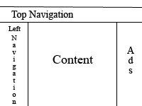
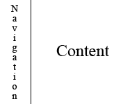
There is not a universal page layout to be used for all websites. Some sites use 2 colums, 3 columns, even 4 for main page layout. It depends on web site type and your needs.Most common wed design is with navigation on left side and text on right.
This is a typical 2 column layout. If you add a column on right you get a 3 column page layout. Right column is often used for secondary navigation, advertisement block or additional information. So it really depends on what elements you want on your site.
| Layout Design 1 | Layout Design 2 |
|
|
 |
2. Make a clean and easy to use navigation.
You don`t want your visitors to get lost. So instead of tricky drop down menus or even worse, flash menus use simple text navigation that is good for users and search engines. Several Researches show that Western societies feel more comfortable with navigation on left side.
3. Use standard fonts
People will visit your website with different Web Browsers and different Operating Systems. If you want your site to look the way you build it use standard fonts like Arial, Times new Roman and Verdana.
4. Limit your color palette to 2 or 3 colors.
Great Web Designs are the simplest ones. Choose three colors that look great together and use them consistently across your site. That way you will have a clear and eye friendly web site.
5. Optimize your graphics for fast loading.
No one waits for slow pages to load, they simply click away. Control size of your images, compress them and resize them so they can be downloaded fast!
 BONUS WED DESIGN TIP:
If you are in doubt use rule: less is more. Web design and graphics mean nothing if your site is cluttered with garbage. Remember that people search for information, not fancy web sites that load for eternity.
Enjoy making your site!
